
Indoor Lighting Design Basics
Use this guide before specifying glass. It translates lighting quantities into practical decisions about room brightness, visual comfort, color rendering, layered scenes, and luminaire placement.
Jump to a question (22)
- What are illuminance, luminous flux, and luminance, and how can ordinary consumers understand them quickly?
- How can you estimate the total luminous flux (lumens) needed based on room area and function?
- How can indoor lighting balance brightness and darkness to reduce visual discomfort?
- How much do wall, floor, and furniture colors and materials affect the lighting effect?
- Why do lamps with the same wattage and color temperature feel very different in brightness in different rooms?
- Does a main-light-free design require a full dropped ceiling, and how can it be done without one?
- What mistakes should be avoided when selecting luminaires for low-ceiling spaces?
- Above a kitchen countertop, is an LED strip, downlight, or spotlight more reasonable?
- How should bathroom mirror lighting be arranged to reduce facial shadows?
- What are the pros, cons, and installation points of bedside wall lights, pendants, and table lamps?
- How should fixture position and light direction be arranged for the sofa background wall and TV background wall?
- How should wardrobe interior lighting be selected so clothes are visible without glare?
- How can stair and corridor lighting provide both safety and guidance through fixture layout?
- In minimalist main-light-free design, how can nearly invisible glass lampshades be selected so luminaires have minimal visual presence?
- Should dining pendant light fall on the tabletop or on the food, and how should color temperature and CRI be selected?
- In movie mode, which living-room lights should stay on and which should be turned off?
- How can lighting for a tea corner or wine cabinet reveal texture without becoming overly heavy?
- How should bedroom night-mode lighting be designed in brightness, color temperature, and position so it does not disturb sleep afterward?
- How can one space switch between daydreaming, reading, and housework through layered lighting?
- How can lighting, rather than partitions, define zones in an open living-dining-kitchen space?
- How can a yoga or meditation corner be lit to support relaxation and focus?
- What pendant hanging heights are recommended for different spaces, and how should they be adjusted according to movement paths?
Light quantities and room brightness
Understand the measurements that determine how much light a room receives and how bright it appears.
What are illuminance, luminous flux, and luminance, and how can ordinary consumers understand them quickly?
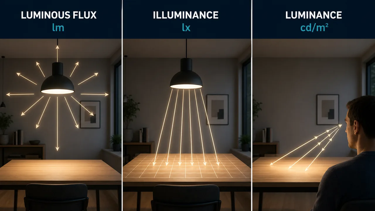
Luminous Flux – The total amount of visible light emitted by a source (such as a bulb or tube) in all directions. Its unit is the lumen (lm). For a consumer, think of it as the total water flow from a faucet — more water means you can water a larger area. Similarly, a higher lumen value means a “brighter” bulb in terms of total light output, regardless of direction. For example, an 800‑lumen LED bulb vs. a 1000‑lumen one: the latter gives out more total light. When buying bulbs, ignore watts (power consumption) and look at lumens: 800 lm is roughly equivalent to a traditional 60W incandescent bulb.
Illuminance – The amount of light falling on a surface, per unit area. Its unit is the lux (lx); 1 lux = 1 lumen/m². In everyday terms, illuminance is the density of light landing on a floor or desk. With a fixed total water flow (lumens), if you pour it into a large basin, the water depth is shallow; pour it into a small cup, the depth is high. Illuminance describes the “depth” of light. For a study desk, recommended illuminance is 300‑500 lux; for a hallway, 100 lux is fine. You can measure it with a lux meter or a phone app. Remember: illuminance decreases rapidly with distance — the farther the lamp, the lower the lux.
How can you estimate the total luminous flux (lumens) needed based on room area and function?
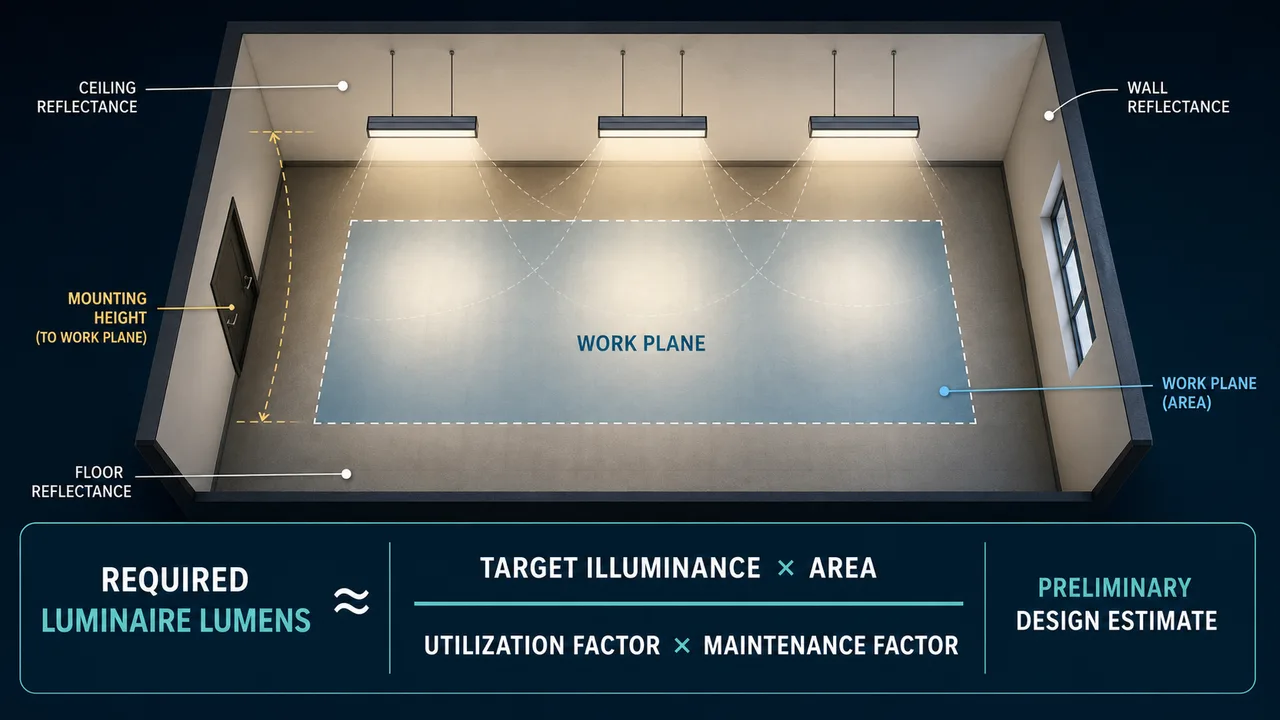
Preliminary household estimate. Multiplying target illuminance by room area gives the lumens that would reach the working plane under an idealized 100% utilization condition: preliminary lumens ≈ target illuminance (lx) × area (m²). This can help a consumer compare the rough scale of a small room and a large room, but it is not a professional lighting calculation and it should not be used as a guaranteed luminaire-output requirement.
Professional lumen-method estimate. A more realistic starting relationship is: required luminaire lumens ≈ target illuminance × area ÷ utilization factor ÷ maintenance factor. The utilization factor represents the proportion of luminaire light that reaches the defined working plane and depends on luminaire distribution, mounting height, room index, surface reflectances, spacing, orientation, obstructions, and working-plane height. The maintenance factor accounts for expected light loss from source depreciation, dirt on luminaires and room surfaces, and the planned maintenance interval.
The target illuminance must also be selected for the actual task and applicable guidance. General circulation, ambient living-room use, food preparation, reading, detailed desk work, and mirror lighting do not have the same requirement. The calculation should define the working plane and check minimum illuminance, average illuminance, uniformity, glare, and the contribution of task lighting rather than distributing one lumen total uniformly across the room.
Wall colour, ceiling height, luminaire type, furniture, and indirect-light geometry can materially change utilization, but fixed percentage corrections for dark surfaces or fixed lumen increments for added ceiling height are only rough household heuristics. They are not transferable design rules. For project work, obtain photometric data for the actual luminaire and use a recognized lighting calculation tool or a measured mock-up with documented reflectances, geometry, utilization assumptions, and maintenance factor.
Scope note: This is a preliminary household estimate rather than a professional lighting calculation.
How can indoor lighting balance brightness and darkness to reduce visual discomfort?
Visual discomfort cannot be attributed to illuminance or colour temperature alone. High illuminance, excessive source luminance, poor glare control, temporal light modulation, strong task-to-background contrast, unsuitable spectral characteristics, and long exposure duration may act together. Statements that a particular colour temperature “doubles fatigue” are not supportable without a defined population, exposure time, spectrum, illuminance, glare condition, measurement method, and outcome metric.
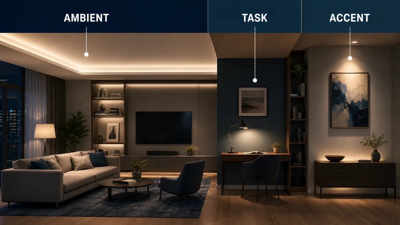
A practical approach is layered lighting. Ambient lighting provides enough general visibility; task lighting raises illuminance only where work is performed; and accent lighting adds visual hierarchy without requiring every surface to be equally bright. The design should avoid direct views of small high-luminance sources and sharp reflected glare on screens, polished stone, glass tables, or glossy cabinetry.
Brightness relationships should be evaluated at normal eye positions. Check the luminous surface of each luminaire, the task area, surrounding walls, circulation paths, and dark adaptation when moving between spaces. Dimming and separately switched layers help users adapt the scene for reading, conversation, television viewing, cleaning, and night use.
Colour temperature may affect preference and appearance, but it is only one variable. Select the source according to the activity, time of use, material palette, colour quality, and user preference, then evaluate illuminance, luminance, glare, flicker, contrast, spectrum, and exposure time together.
How much do wall, floor, and furniture colors and materials affect the lighting effect?
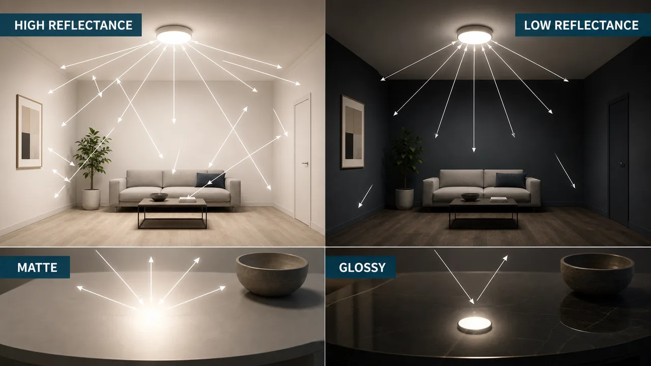
Room surfaces influence both the amount and the spectral composition of reflected light. High-reflectance ceilings and walls can increase the proportion of luminaire light that reaches the working plane, while dark finishes generally reduce inter-reflection and may require a different luminaire distribution or quantity. The magnitude cannot be assigned from colour names alone; measured reflectance, room geometry, finish, and luminaire photometry are needed for calculation.
Warm-coloured surfaces can make reflected light appear warmer, but the magnitude of the shift depends on the surface reflectance spectrum and the light-source spectral power distribution (SPD). It is not technically correct to state that a 4000 K source “becomes 3000 K” without measuring the chromaticity or spectrum of the reflected light under defined geometry.
Gloss and texture also matter. Glossy materials can create directional reflections and visible source images; matte surfaces spread reflection more broadly; deep textures may create local highlights and shadows. Floors, worktops, television screens, mirrors, polished metal, and glass furniture should therefore be checked from normal viewing positions for reflected glare.
For design development, record the intended surface materials and approximate reflectances, use the actual luminaire photometric file, and review a mock-up when appearance is critical. If colour shift is a concern, compare samples under the intended source and measure reflected chromaticity instead of converting the effect into an assumed CCT change.
Why do lamps with the same wattage and color temperature feel very different in brightness in different rooms?
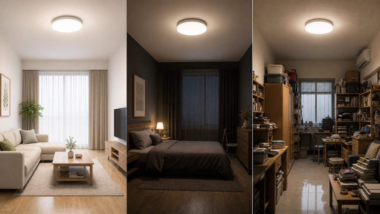
You may notice that the same bulb feels bright in a white living room but dim in a dark-colored bedroom. It’s not the bulb’s fault — the room itself is “cheating.” Simply put, the brightness we perceive depends not only on the bulb but also on how light “bounces around” the room. The colors of the walls, ceiling, floor, the size of the room, and how much furniture is inside all affect how much light finally reaches your eyes.
Wall color is the biggest “helper” or “thief.” Light-colored walls and ceilings act like mirrors, bouncing light around and making the whole room bright. White walls can reflect 70-90% of the light. Dark walls (like dark gray or navy) eat up light — you give them 100%, they might spit back only 20%, absorbing the rest. So, the same lamp in a white room can feel like 20 watts, but in a dark room it may feel like only 5 watts.
Layered lighting and room layouts
Apply ambient, task, and accent lighting to kitchens, bathrooms, bedrooms, living rooms, circulation spaces, and open plans.
Does a main-light-free design require a full dropped ceiling, and how can it be done without one?
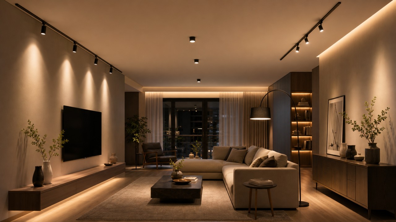
A layout without one dominant ceiling fixture does not require a full dropped ceiling. Surface-mounted downlights, track systems, wall lights, floor lamps, cabinet lighting, and indirect light from shelves or curtain pockets can provide ambient, task, and accent layers while preserving ceiling height.
The design should begin with activities and viewing positions rather than with fixture type. Coordinate beam distribution, source shielding, switching zones, dimming, cable routes, driver access, ceiling structure, and maintenance. A mock-up is useful where reflected light or concealed linear lighting provides a large part of the ambient illumination.
What mistakes should be avoided when selecting luminaires for low-ceiling spaces?
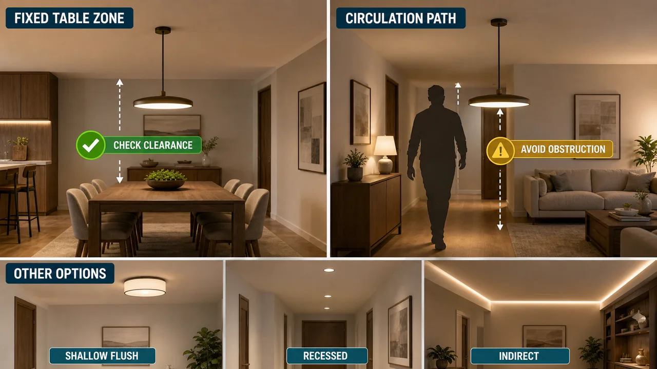
Low ceilings do not create a universal ban on pendants or chandeliers. The relevant checks are finished-floor clearance, movement routes, furniture position, fixture diameter and visual mass, direct-view glare, beam spread, and access for cleaning or replacement. A pendant over a fixed table may be acceptable where the same drop would be unsafe in a circulation path.
Flush, shallow surface-mounted, recessed, track, wall-mounted, and indirect systems can reduce visual obstruction, but thinness alone does not guarantee good lighting. Compare luminous-area brightness, source shielding, ceiling uniformity, driver temperature, service space, and the actual room proportions before approving the layout.
Above a kitchen countertop, is an LED strip, downlight, or spotlight more reasonable?
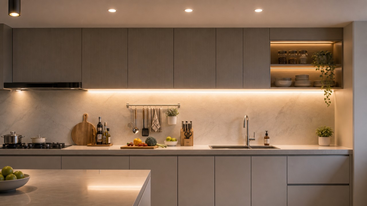
Under-cabinet linear lighting is often effective because it places light in front of the user and can reduce body-cast shadows across the worktop. It does not automatically eliminate every shadow, LED image, reflection, or glare point. Performance depends on mounting position, channel shielding, diffuser, source spacing, worktop reflectance, cabinet depth, and the user's viewing angle.
Ceiling downlights can supplement ambient light or serve counters without upper cabinets, but their location and distribution should be checked against the user's standing position. Narrow spotlights are normally better reserved for accent tasks unless several beams are designed to overlap. Approve the arrangement by measuring work-plane illuminance and uniformity and by checking glare, shadows, colour rendering, cleaning access, and surface temperature in the completed kitchen.
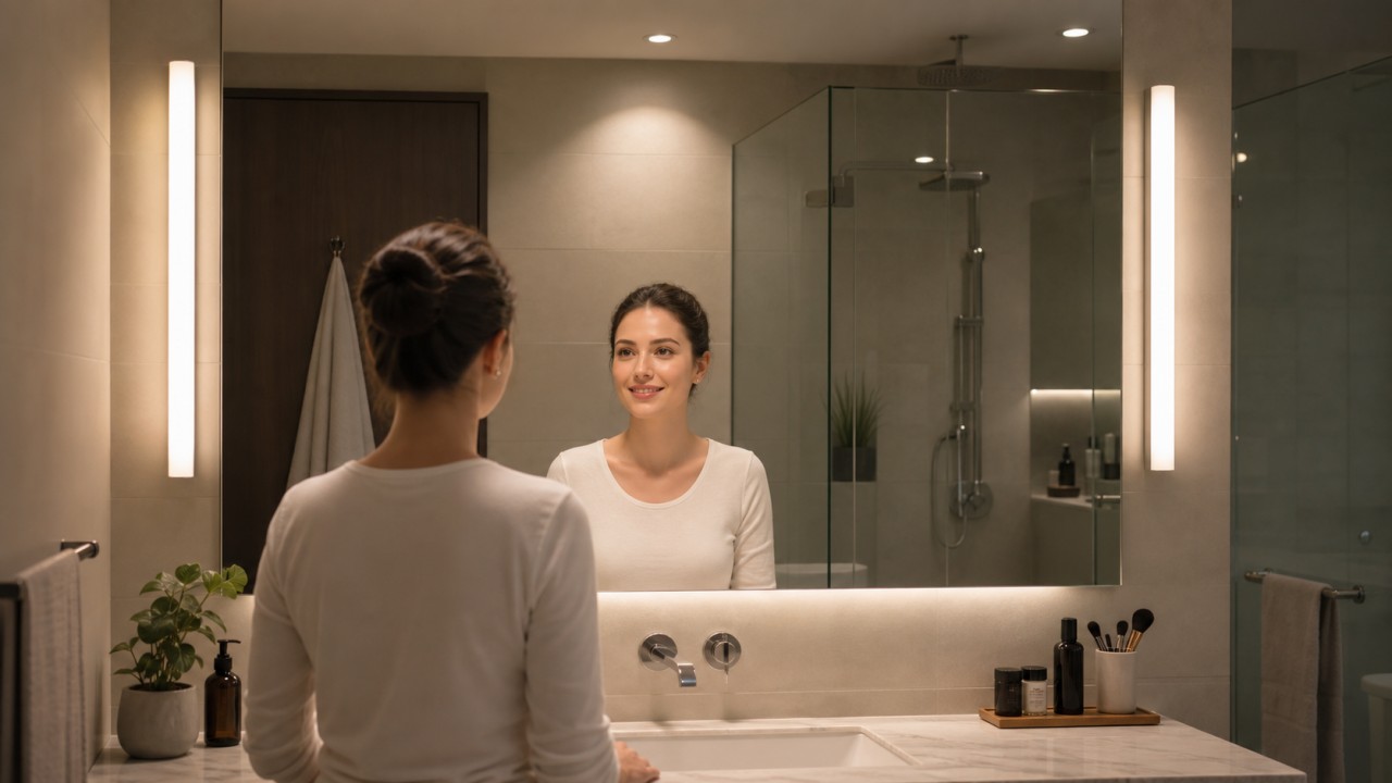
How should bathroom mirror lighting be arranged to reduce facial shadows?
Facial shadows become more pronounced when light arrives mainly from above or from one side. A useful starting point is to place diffused light on both sides of the mirror, near face height, or to use a tested illuminated-mirror arrangement that provides light from several directions. The final result depends on mirror width, mounting height, user position, source luminance, diffuser area, room reflections, and the distance between the face and the mirror.
A top light can contribute ambient illumination, but it may create shadows under the eyes, nose, and chin when used alone. Side lighting, vertical edge lighting, or a combined top-and-side arrangement can reduce those shadows. It is not necessary to prohibit every top-only installation; instead, review the face from expected standing positions and add side or frontal light when the measured or observed uniformity is inadequate.
Dimensions such as sconce height, spacing, and offset should be treated as layout starting points rather than fixed rules. Confirm that users of different heights do not see exposed LED points or high-luminance reflections in the mirror. Wet-zone classification, electrical protection, sealing, corrosion resistance, accessible temperature, and cleaning access must follow the applicable bathroom-luminaire requirements for the target market.
Approve the arrangement with a representative mock-up or completed bathroom. Check facial illuminance, left-to-right uniformity, reflected glare, colour rendering, colour consistency, flicker, switching or dimming behavior, and the appearance of skin tones under the actual wall and countertop finishes.
What are the pros, cons, and installation points of bedside wall lights, pendants, and table lamps?
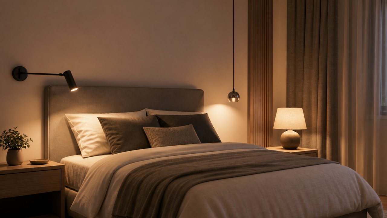
Bedside lighting is mainly used for reading, using a phone, getting up at night, and creating a cozy atmosphere. The ideal bedside lamp should provide soft, non-glaring light, be adjustable in direction or brightness, not take up valuable nightstand surface, and be easy to switch on and off. Different types of lamps vary greatly in these aspects.
Wall sconces are mounted on the wall, typically on both sides of the bed at about 100-120cm from the floor (slightly above shoulder height). Lighting advantages: They don’t take up nightstand space – great for small rooms. Choose models with adjustable arms that can be swiveled and tilted for directional reading light with minimal disturbance to a partner. The higher angle creates a downward reading-like light. Lighting disadvantages: Fixed position cannot be moved later. If the shade has no glare control, the bare bulb can be harsh. Some sconces cast a very narrow pool of light. Installation advantages: No need for an outlet on the nightstand; wiring is hidden in the wall – clean and tidy. Installation disadvantages: Requires pre-planned wiring during construction (height and position must be decided early). Retrofitting is expensive and messy. Repair or replacement may involve opening the wall.
How should fixture position and light direction be arranged for the sofa background wall and TV background wall?
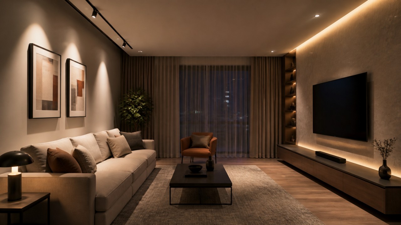
The two walls in a living room have opposite lighting goals. The sofa wall is mainly for creating ambiance, highlighting artwork or wall textures, and works well with wall-washing lights to create layered shadows. The TV wall needs to avoid light bouncing off the screen, while still keeping the wall from being too dark. Once you understand these different tasks, you’ll know where to place the lights.
For the sofa wall: wall-washing + accent lighting. Use recessed spotlights or track spotlights, installed 20-30cm from the wall (center of light to wall), spaced 80-120cm apart. The light direction should be diagonally downward for wall-washing, so the beam starts near the ceiling and “washes” down the wall. If there is artwork above the sofa, add an extra spotlight directly above the art (same distance from the wall) with a 24° beam angle for precise highlighting. A more advanced option: install upward-facing LED strips in the ceiling cove above the sofa wall, bouncing light off the ceiling – extremely soft and glare-free.
How should wardrobe interior lighting be selected so clothes are visible without glare?
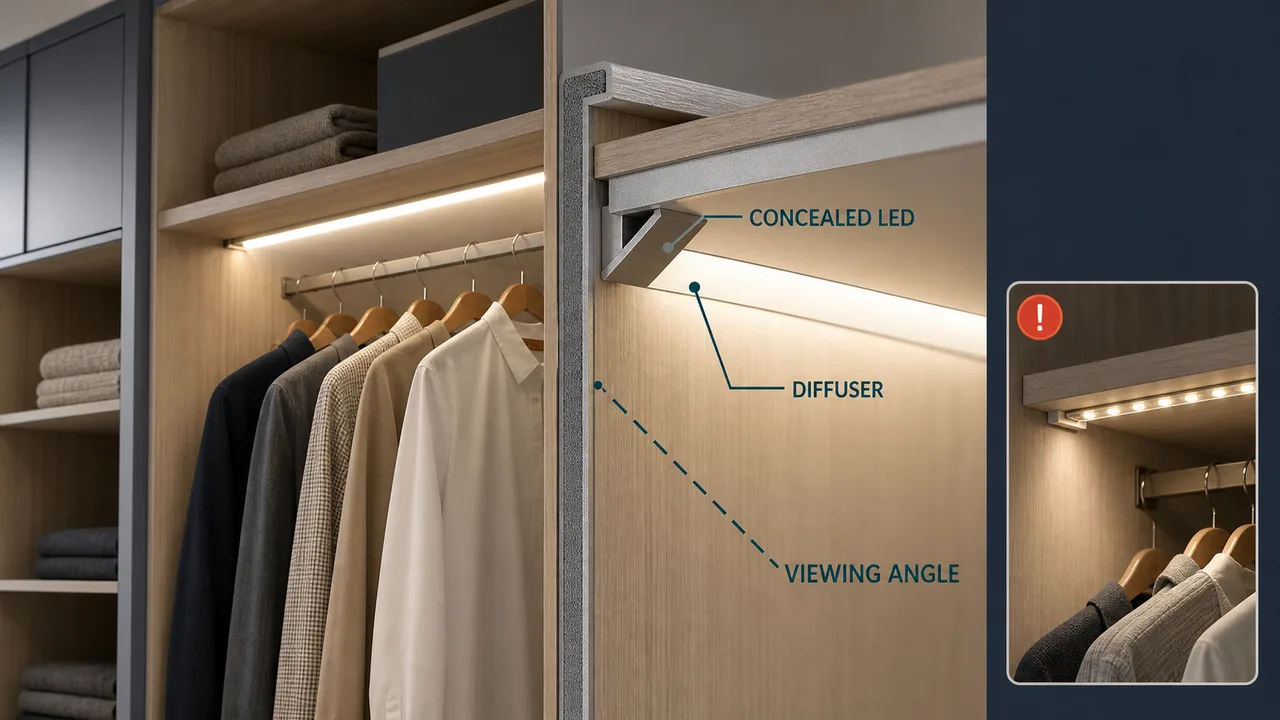
Wardrobe lighting should make colours and details visible while keeping bright LED points outside normal viewing directions. Linear LED systems can provide continuous coverage, but the result depends on LED pitch, source-to-diffuser distance, channel geometry, reflectance, shelf depth, garment position, and viewing angle. COB construction can reduce visible point images, but it does not by itself guarantee a dot-free or glare-free installation.
Place the light near the front of a shelf or vertical cabinet edge when that position directs light onto garments without exposing the emitting surface to a standing or seated user. Rear placement can create a softer effect but may leave the front of hanging clothes darker. Spotlights may be useful for display zones, while continuous linear lighting is often easier to use for shelves and hanging bays.
An aluminium profile can provide heat spreading, mechanical protection, and a controlled diffuser interface. Profile depth and angle should be selected from the LED package, power density, diffuser, cavity dimensions, ventilation, and permitted temperature rise; a fixed depth such as 50 mm is not a universal requirement. Confirm driver location, cable protection, sensor behavior, clearances from fabrics, and service access.
Evaluate the finished wardrobe with representative dark and light garments. Check vertical illuminance, colour rendering, colour consistency, LED-point visibility, reflected glare, surface temperature, dimming, door-sensor timing, and shadowing at the ends and behind rails. Installation instructions and electrical requirements should follow the applicable product and furniture-lighting rules.
How can stair and corridor lighting provide both safety and guidance through fixture layout?
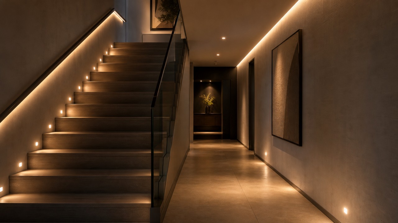
The core concept of lighting stairs and hallways is to balance two goals: first, to provide a strong sense of safety by eliminating dark spots and glare that could cause tripping; second, to create clear wayfinding that intuitively guides occupants or visitors through the space. The key to achieving this balance lies in using multi‑layer, low‑level, continuous luminaire placement combined with smart motion sensing, avoiding the shadows and disorientation caused by a single overhead source.
The most hazardous areas in stairs and hallways are step edges, corners, and the junction between floor and wall. A single ceiling light often casts a person’s shadow onto the stairs, creating sharply alternating bright and dark zones that increase the risk of missteps. To solve this, consider step lighting: install recessed LED strips under the riser of each step, or at the side of each tread. Alternatively, use baseboard light strips mounted 30‑40 cm above the floor. These low‑level continuous lights clearly outline every step, allowing safe ascent or descent even when the main light is off. For hallways, install wall sconces or recessed corner lights at 30‑50 cm height on both sides to avoid harsh floor reflections.
In minimalist main-light-free design, how can nearly invisible glass lampshades be selected so luminaires have minimal visual presence?
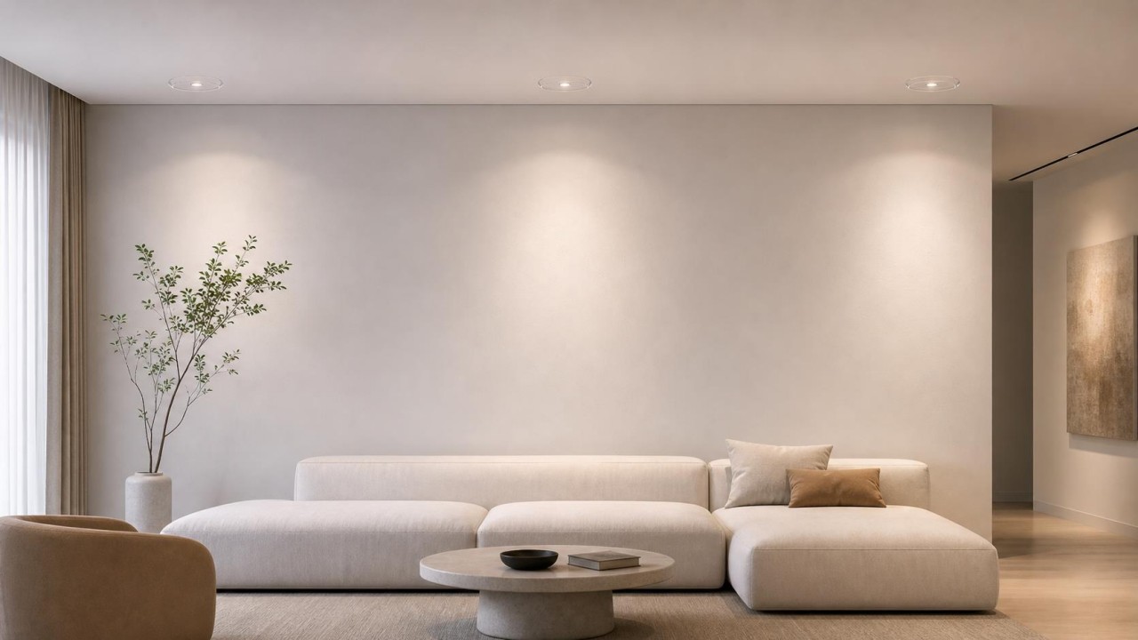
Minimalist no-main-light design is not about having no lamps. It is about making the fixtures recede into the architectural background so that only clean light remains. If a glass shade is poorly chosen, it can become visually obvious because of reflection, edge color, thickness, frame detail, or shiny highlights. To make the shade almost invisible, control material, color, reflection, mounting, and light distribution together.
First, the glass color should be as neutral as possible. Clear low-iron glass, light opal glass, pale neutral-grey glass, and high-uniformity diffusion glass are suitable for minimalist interiors. Avoid amber, tea-colored, dark smoked, strongly coated, or saturated colored glass, because these turn the fixture into a decorative focus. If the ceiling or wall is white, the shade should visually blend with that surface. If the interior uses grey plaster or microcement, low-reflection pale grey glass may work better.
Second, surface reflection should be low. Glossy clear glass reflects windows, furniture, and people, making the fixture noticeable in daylight. Low-reflective coated glass, AG anti-glare glass, fine acid-etched glass, or subtle matte glass can reduce mirror-like reflections when the lamp is off. However, the matte finish should not be too rough or it may become a visible white patch.
Should dining pendant light fall on the tabletop or on the food, and how should color temperature and CRI be selected?
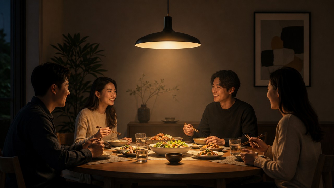
The dining pendant should mainly light the tabletop and food area, not people's faces and eyes. More precisely, it should illuminate the center of the table, dishes, and food while allowing the surrounding room to remain slightly dimmer. If the beam is too narrow, it feels like a stage spot and the table edges become dark. If it is too wide, the dining area loses focus.
Mounting height should avoid blocking sight lines and direct glare. A common range is about 70-90 cm from the bottom of the pendant to the tabletop. For long tables, use multiple pendants or a linear pendant so the table is evenly covered. The shade should hide direct view of the bulb. Opal glass, light smoked glass, subtle texture, or internal diffusion can reduce glare compared with a fully exposed clear bulb.
Recommended CCT is usually 2700K-3000K, making food look warm and appetizing. Modern open kitchen-dining spaces can use 3000K-3500K. CRI should preferably be Ra 90 or higher; good R9 helps render meat, fruit, and warm-colored food. Low-CRI cool white light is not suitable for dining because it can make food look grey, cold, or unappealing.
In movie mode, which living-room lights should stay on and which should be turned off?
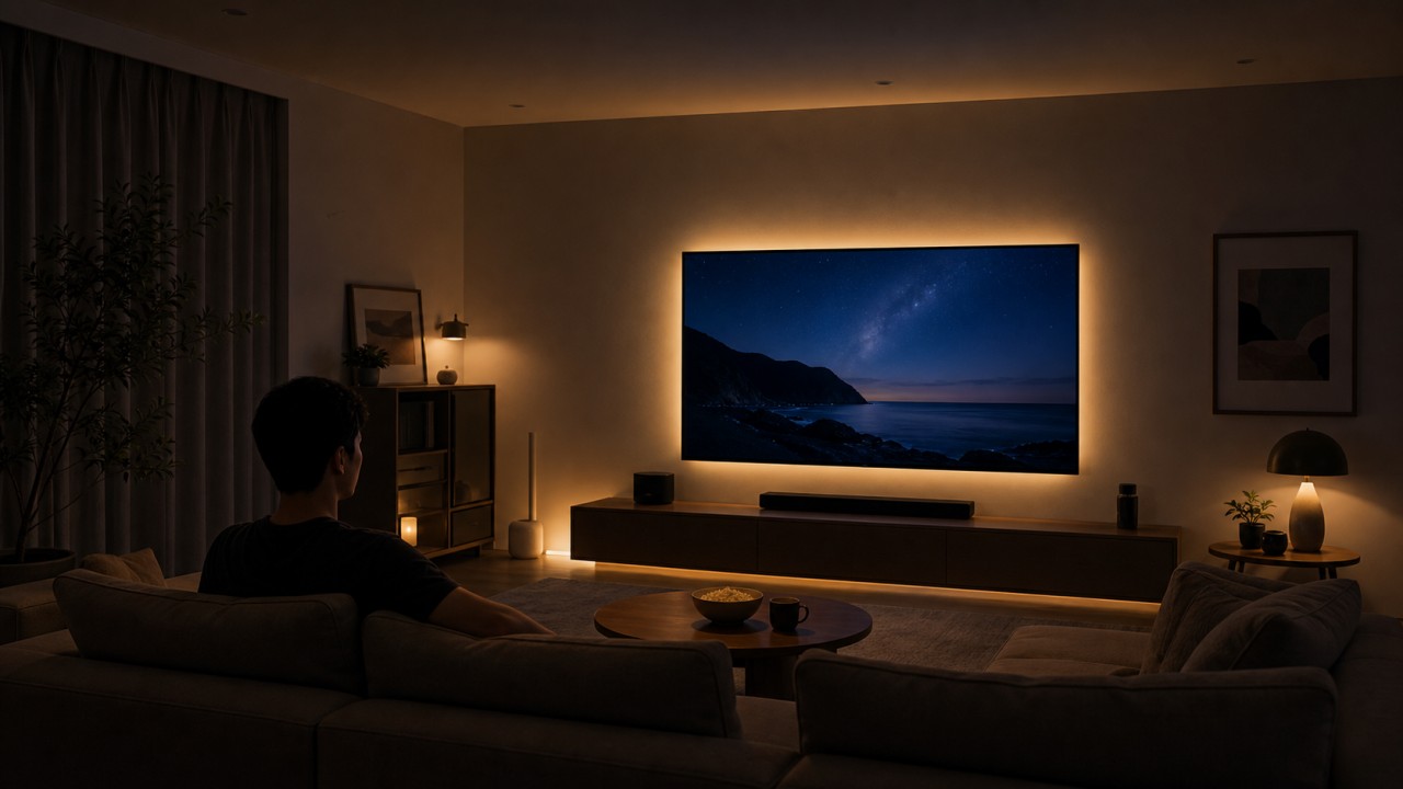
Movie mode should reduce reflections on the screen and direct glare to the eyes, while keeping a small amount of low-level background light. This prevents the eyes from repeatedly adapting between a bright screen and a completely dark room. Turn off main ceiling lights, spotlights, and bright pendants that face the TV, hit the screen, or enter the viewer's eyes.
Keep low-position, indirect, warm, and dim lights: bias lighting behind the TV, a floor lamp behind or beside the sofa, toe-kick lights, strip lights, or cabinet-reflected light. The light should fall on walls or floors, not directly on the screen, and should not create visible screen reflections. CCT can be 2200K-3000K, with very low brightness.
If the living room has grouped controls, a good movie scene is: ceiling lights off, TV-wall spotlights off, TV bias light at 10-20%, sofa-side lamp at 5-15%, and toe-kick or pathway lights at low level. This keeps immersion while still allowing safe movement and easy access to objects.
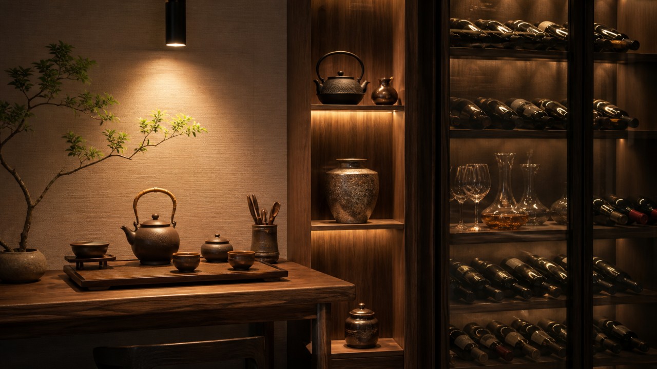
How can lighting for a tea corner or wine cabinet reveal texture without becoming overly heavy?
Lighting for a tea corner or wine cabinet should reveal material texture without becoming overly theatrical. The key is small-area accent light plus soft ambient light, giving highlights to ceramics, glass, wood grain, bottles, and liquid while avoiding an excessively dark surrounding.
A tea area works well with warm 2700K-3000K light and Ra >= 90. Light can come from the upper side or front side, falling on the tea setting and creating gentle shadows. Avoid strong direct glare on reflective teaware. Use a medium-narrow spotlight, low-luminance pendant, or concealed strip. For wine cabinets, use linear lights, shelf lights, or backlighting. CCT can be 2700K-3500K depending on style. Clear bottles benefit from backlight or side light, while dark bottles need front-side or upper accent light.
The key to avoiding heaviness is contrast control. Accent light can be about two to four times brighter than ambient light; the surroundings do not need to be black. Glass shades can be light smoked, low-iron clear, subtly textured, or low-haze diffusing glass, preserving highlights while reducing harsh reflection. Dimming is important: use low levels for evening mood and higher levels for display.
How should bedroom night-mode lighting be designed in brightness, color temperature, and position so it does not disturb sleep afterward?
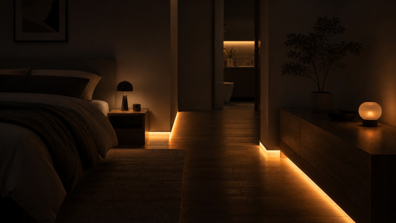
Night-mode bedroom lighting should not illuminate the whole room. Its job is to let people see the path safely while minimizing eye stimulation and circadian disruption. Brightness should be very low, often only about 1-5 lx on the floor or path. The bedside or bathroom entrance can be slightly higher, but there should be no harsh bright points.
Use warm low-CCT light, about 1800K-2700K, and avoid cool white light. The light position should be low, indirect, and away from the eyes: under-bed strips, baseboard lights, motion-sensor footlights, wardrobe-bottom lights, or a low light near the bathroom door. Do not use ceiling downlights or strong bedside lamps as night lights.
Control can use motion sensors, bedside foot sensors, low-level buttons, or smart scenes. The on-time should be short, with fade-in and fade-out if possible. Glass shades should be high-haze and low-luminance, not clear point-source covers. A good night light lets the user move safely without fully waking up, so returning to sleep remains easy.
How can one space switch between daydreaming, reading, and housework through layered lighting?
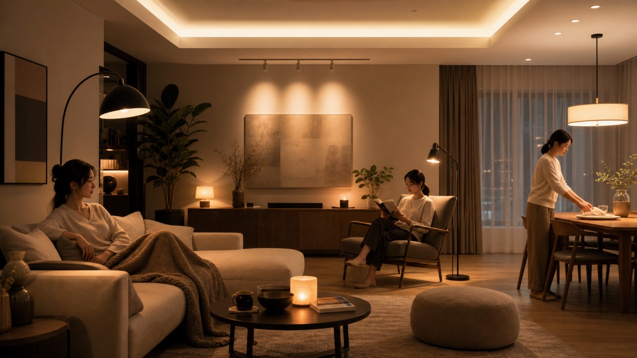
To support daydreaming, reading, and housework in one space, divide lighting into ambient light, task light, accent light, and mood light, with separate control. Do not rely on one main lamp dimmed up and down, because different activities need different light positions and brightness distributions.
For resting or doing nothing, use low-level warm ambient light plus a little wall or corner light. Around 2700K with gentle contrast works well. For reading, add local task light so the page reaches about 300-500 lx, while keeping some background light to avoid excessive contrast. For housework, use higher overall brightness and better uniformity: ceiling diffusion, cabinet lights, and work-zone lights. CCT can rise to 3000K-4000K for clarity.
A practical setup includes a dimmable ceiling or linear light for base light, a floor or table lamp for reading, wall lights or strips for mood, and cabinet lights for storage and cleaning. Scene control should be simple: rest at 30%, reading with ambient at 40% plus reading lamp at full, and housework with general lighting at 70-100%. Layered lighting lets the room respond to life, instead of staying at one brightness all the time.
How can lighting, rather than partitions, define zones in an open living-dining-kitchen space?
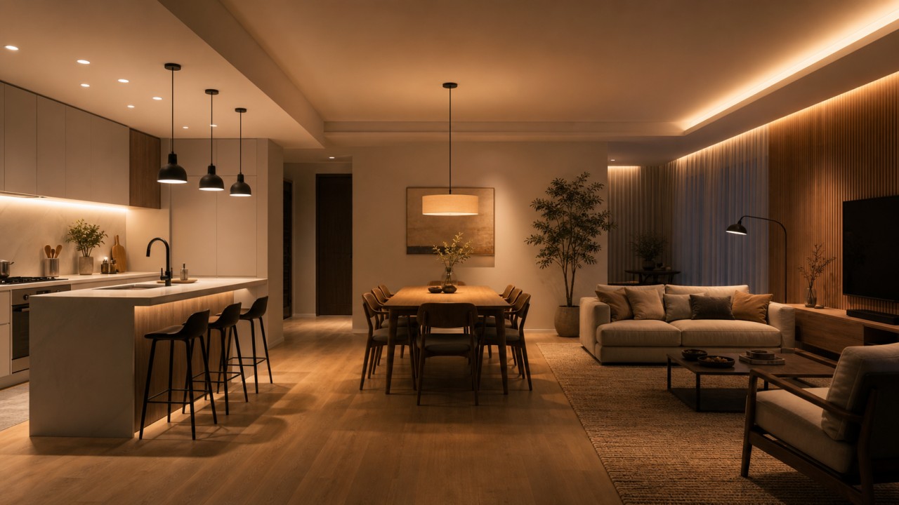
An open living-dining-kitchen space does not need partitions to feel zoned. Lighting can create boundaries through different brightness levels, beam directions, fixture types, and color-temperature moods, while keeping the overall style consistent.
The kitchen should be the clearest zone: high countertop illuminance, even light, good CRI, and often 3500K-4000K for food preparation. The dining area can use a pendant or linear light to focus light on the table, usually 2700K-3000K, creating a visual center. The living area should use softer ambient light, wall washing, floor lamps, and TV bias lighting, with lower brightness and a more relaxed mood.
Transitions should be gentle, not abrupt. Use the same material language or fixture family for unity, while changing mounting height and light distribution for function. Grouped controls are essential: cooking, dining, movie watching, and hosting guests should have separate scenes. Even without walls, people will naturally read the kitchen, table, and lounge as different zones.
How can a yoga or meditation corner be lit to support relaxation and focus?
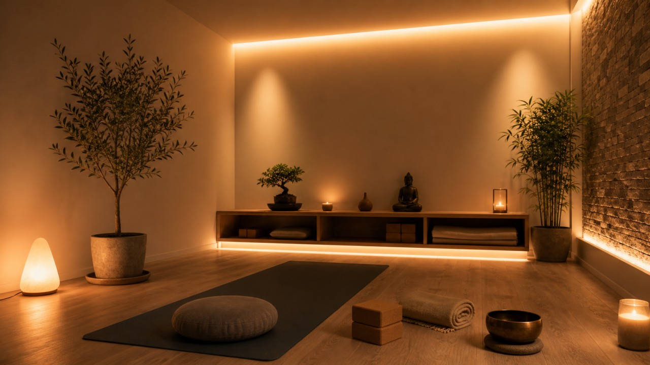
A yoga or meditation corner should feel quiet, low-stimulation, and adjustable. It does not need to be very bright. It needs soft, stable, low-glare light with a calm rhythm. Base lighting can come from indirect light, wall-reflected light, low-level strips, or soft lamps with opal glass shades. Avoid strong overhead downlights shining into the eyes.
Recommended CCT is 2700K-3000K, and evening meditation can go down toward 2200K. Dimming is important: use more light for stretching or cleaning the mat, and lower levels for meditation. Light should come from the side, wall, or floor reflection, not from a bright point in the line of sight. Suitable glass shades include high-haze opal, fine frosted, or low-reflective soft glass.
For a sense of ritual, add one low-brightness accent light aimed at a plant, fabric, or textured wall rather than at the person. Avoid rapidly changing colored lights or dynamic effects because they distract attention. Good yoga lighting gently defines the body, keeps the space quiet, and lets attention return naturally to breathing.
What pendant hanging heights are recommended for different spaces, and how should they be adjusted according to movement paths?
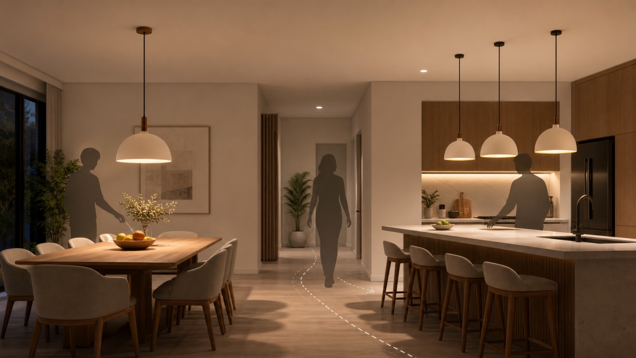
Pendant height should consider lighting effect, sight lines, head-clearance risk, and room proportion. For dining tables, the bottom of the pendant is commonly about 70-90 cm above the tabletop. This focuses light on the table without blocking eye contact. Bar pendants can be about 75-95 cm above the counter, with even spacing between multiple fixtures.
For a living-room chandelier, ceiling height and movement paths matter. In general, the bottom should not be lower than about 2.1 m above the floor, and should be higher in frequent walking paths. If the pendant is directly above a coffee table where people do not walk underneath, it can be slightly lower, but should not glare into seated eyes. Bedside pendants should avoid the path of sitting up and turning over; the bottom can be about 40-60 cm above the nightstand, but not in a head-impact zone.
To adjust height, map human movement: entry path, sofa to balcony, dining-chair pull-out, getting out of bed, cabinet-door opening. The pendant should not fall into head height along these paths. Large glass chandeliers also need clearance for swing, cleaning, and lamp replacement. Height is not a fixed formula; it depends on fixture size, table height, ceiling height, and human behavior.
Contact Us
Your feedback fuels our growth, and your questions drive our solutions.
We value your feedback, inquiries, and suggestions. Please feel free to get in touch with us
General inquiries
Please contact us via sales@bo-glass.com, and we will reply to you as soon as possible.
Interested to work with us
Drop your resume at info@bo-glass.com
and we will get back to you shortly.
We uses the contact information you provide to us to contact you about our relevent content, products, and services.